Mexico 1968
I was excited to see that famed designer Lance Wyman recently took to Instagram to share from his archive. Wyman designed one of my favorite things ever, this landmark 1968 Mexico City Olympics identity system, and I found myself down a design rathole.


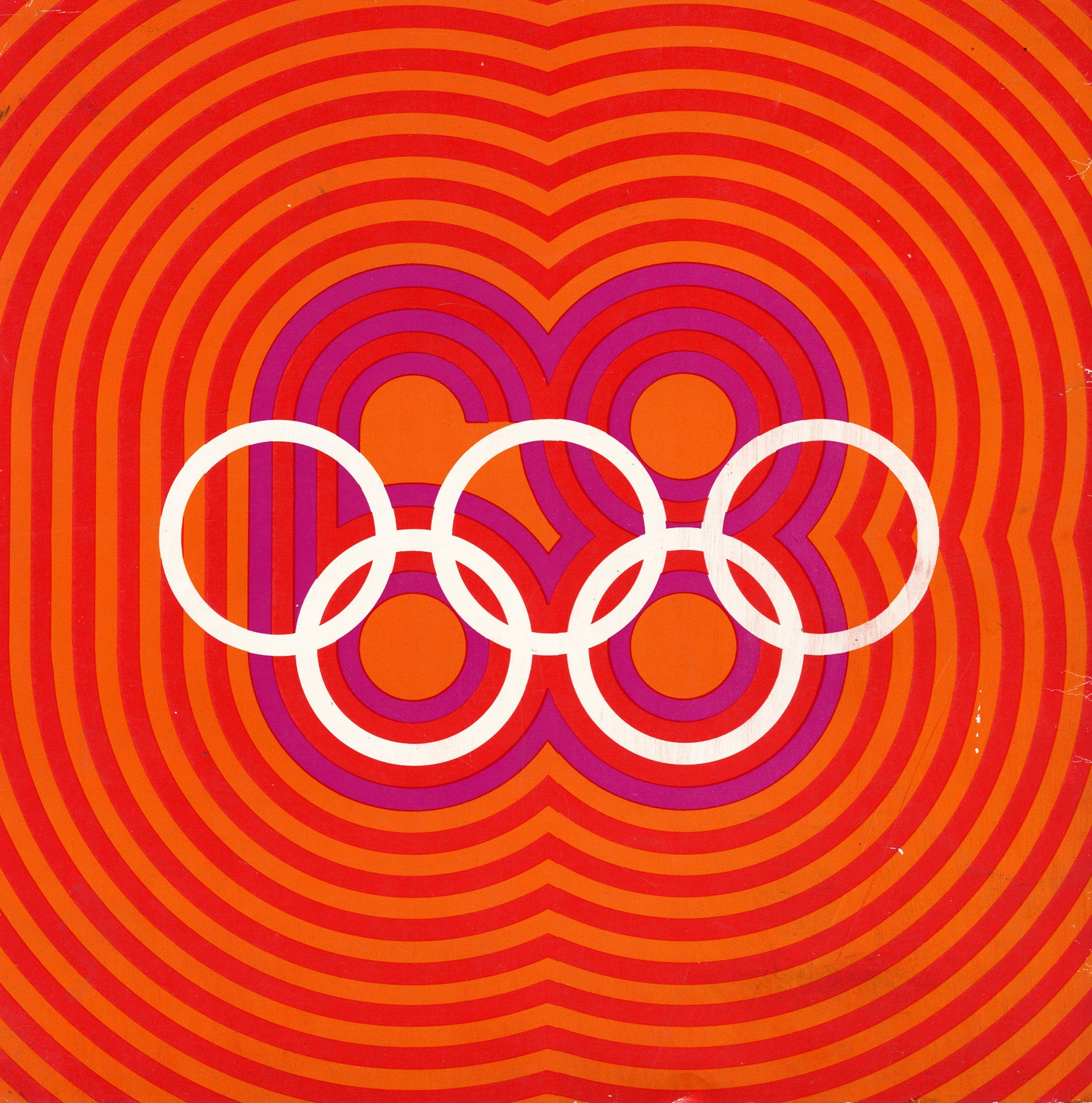
The 1968 games were the first to use a truly comprehensive graphic design system, encompassing everything from logo to event symbols to city signage to clothing to the stadia themselves. This scale of design effort is now commonplace. Every two years the Olympic design system becomes a lightning rod (and sometimes a punching bag) for armchair designers everywhere. The best ones are able to combine current design trends with timeless influences native to the host region. In this sense, I think Wyman’s Mexico system is a masterwork. The signature element — those colorful, radiating lines — were inspired both by a prevailing movement of the time, “Op-Art” (Optical Art), but also centuries-old indigenous Aztec art. The result is hypnotic, insinuating movement and energy and joy. Let’s face it, it’s just a groovy reflection of this unique time in history.


But this being 1968, it wasn’t going to be uncomplicated or trivial. Just 10 days prior to the start of the games, police opened fire on student protesters in Mexico City’s Tlatelolco section, unofficially killing hundreds. As waves of protests continued, and the Games marched on, the identity system found itself co-opted, hijacked, and used by the resistance to create anti-government propaganda. The Olympic rings were wrapped in tank tracks. Wyman’s ubiquitous dove icon got a bloody shot of red spray paint. (Wyman has said in interviews he supported this).

In the end he’d created something that was not only a functional and logistical marvel, but powerful enough to inspire a hugely diverse range of emotion. If that isn’t the definition of art, I’m not sure what is.